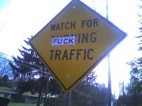
 This one is not for the kids due to the strong language used.
Saw this clever modification of a traffic sign on my travels today. We pulled over to take a picture. Certainly the use of the profane language makes a bold statement that grabs the eye of a potential audience. What is the author trying to communicate? It looks like someone printed out the word on a printer and then taped it on the sign using clear tape. They should have used a slightly larger font to match or even spent more money and used a sticky printable label for durability.
On the whole it is a bold statement on how this person feels about the traffic. Maybe we shouldn't be turning, we should be doing something else, perhaps the suggested act. Do you think this is free speech, vandalism or art on this traffic sign? Post your opinions and criticisms in the comments.
1 comment:
This sign alteration is a practice derived from a popular book, the title of which my corporate firewall will not allow me to enter here! But you can probably guess. See this link:
http://www.amazon.co.uk/exec/obidos/ASIN/0811850722/202-3103774-9799833?%5Fencoding=UTF8
The book makes a specific point of the signs being in a different style and font, to make it clear that the sign has been defaced, and a statement is being made. I've yet to see sich a sign in the wild, but the book is full of fantastic 'artistic defacements'.
Post a Comment