In which the author ponders the question, "If you admit that you are a hypocrite, are you really a hypocrite?" He then provides his honest commentary on a number of fascinating topics. He insists, however, that his readers form their own opinions.
Monday, November 21, 2011
Trilobites at the National Museum of Natural History in DC
Trilobite fossils marching off to infinity.
Actually these are fossils of individuals at different stages of development.
Passion Flowers at the National Botanical Gardens in DC
These flowers have crazy colors and very delicate spidery petals, but they are real.
This message has been sent using the picture and Video service from Verizon Wireless!
To learn how you can snap pictures and capture videos with your wireless phone visit www.verizonwireless.com/picture.
Note: To play video messages sent to email, Quicktime@ 6.5 or higher is required.
Wednesday, November 02, 2011
Where are the jobs? Small businesses or large?
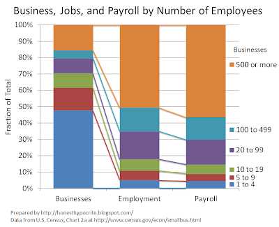
Howard points to a chart that shows that while small business (1 to 4 employees) may be the largest number of businesses, they only make up 5% of the jobs and payroll in the economy. I felt the chart presented...
...didn't allow for the clear comparison that would make the point hit home, so I made a new one with the data from the U.S. Census Bureau (Table 2a. at this link).
Now with the bars lined up and the totals adding up 100%, you can compare business size to its fraction in each of the bars, and you can see how that fraction of the total changes using different weighting measures. The lines provide a guide to link up the comparisons of fractions across the various weightings - fraction by business, fraction by jobs, fraction by payroll.
Its clear that while there may be a lot of small businesses, they don't have the larger fraction of employees or payroll. You might look at the chart this way, if you are employed, or if I pluck a random person from employed person from the economy, it is most likely that they are employed at a firm with 500 or more people. If you own a business it is most likely that your business has 1 to 4 people. Which question matters more to you?
I also went to far and created a chart with the details on business sizes up to 10,000 people. This chart is busier, but it at least answers the questions of those who think the 500 and up bucket was too large on the last chart. While businesses with 10,000 or more employees represent only 9% of business, they represent almost 30% of jobs and more than 30% of salaries.
As to whether small business or large business are the engines of job creation, we need more information on growth rates of employment and information on movement of the businesses between the bins. Still I agree that it is incorrect to say that small business have the majority of jobs, that's just plain wrong.
Subscribe to:
Posts (Atom)


