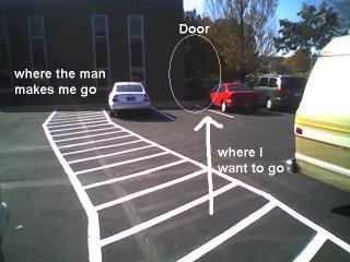
 They resurfaced and then repainted the parking lot where I work. One of the things they are very serious about here is walking on the crosswalks, even across parking lots. The crosswalk above used to go straight across to the building, which was OK because the traffic flow is to the door, towards the right as I have indicated. When they got around to painting the crosswalk and parking spaces, I think they realized a little too late that the spaces might need to line up across the lot so that the crosswalk could line up also. They must have done some planning because you can still see the chalk marks (which they didn't follow) they put down to guide the painting.
The conclusion of it is that the crosswalk now turns left, which is the total opposite direction of the flow. Great job. Also heaven forbid that one leaves the crosswalk around here to go with the expedient direction towards ones destination. I guess one instance of this isn't so bad, but just to have taken one more minute to think about it could have been a major improvement. Imagine a million of these missed optimizations and you have modern urban planning, and a subtle wrongness and inefficiency about everything that can slowly drive you crazy.
You see this effect on college campuses especially. Students walk where they will, often across the grass. Usually this produces little deer runs of paths where no grass grows because of the traffic. Some campuses use this to their advantage and then pave those spots and let the flow define the paths. Some campuses fight and fight by putting up fences and replanting grasses and putting hedges up. Anything to stem the flow. The students still walk were they will, now over fences and through the hedges, and the path remains.
Which type of mind set painted the parking lot?
No comments:
Post a Comment